
Desperate designs: Microsoft Bob legacy

Since I'm moving to a different city, I had to find a moving company for my furniture and the servers. Here in France, the user experience when dealing with those companies ranges from poor to “WTF happened in the head of the guys who did this freaking website and why are they hating so much the unfortunate users?” The most popular form consists of asking you to fill some information the company don't even use; then, a guy from the company calls you and leaves on your answering machine a message asking to call a number. So they wasted time developing a useless form, just to waste your time filling it so they could waste their time calling you to give you a phone number. Like if simply putting the phone number on the website instead of the stupid form is that difficult...
But I'm not here to talk about the general despair of those companies. Among them, there was one which did an impressive feature: a feature which was impressively useless and annoying.
Case study
Those of the readers who are older than me, or those ones who are interested in design, should remember the 1995's Microsoft Bob—“one of Microsoft's more visible product failures” according to Wikipedia, as well as The Magic Cap from General Magic released in 1994. Despite their rapid failures, they gave rise to a bunch of other doomed products, which have in common with their ancestors the fact that they completely misunderstand the limitations of metaphors in interfaces. As Alan Cooper explained in About Face 3, page 272:
By reflecting the physical world of mechanisms, most metaphors firmly nail our conceptual feet to the ground, forever limiting the power of our software. [...] [t]hey tie our interfaces to the Mechanical Age artifacts. [...] Why not abandon this slavish devotion to metaphor and give the user easy access to functions?
Now wouldn't it be exciting to reuse an example of a total failure twenty years later, in order to fail once again? This is exactly what one of the moving companies did on their website. The problem they tried to solve is simple: most forms ask to enter the volume of the furniture, but users may not necessarily be able to measure this volume easily themselves: it would be much easier to let them select the elements from the list of furniture, and the online tool will get the result magically. Good idea. Except that they did it this way:
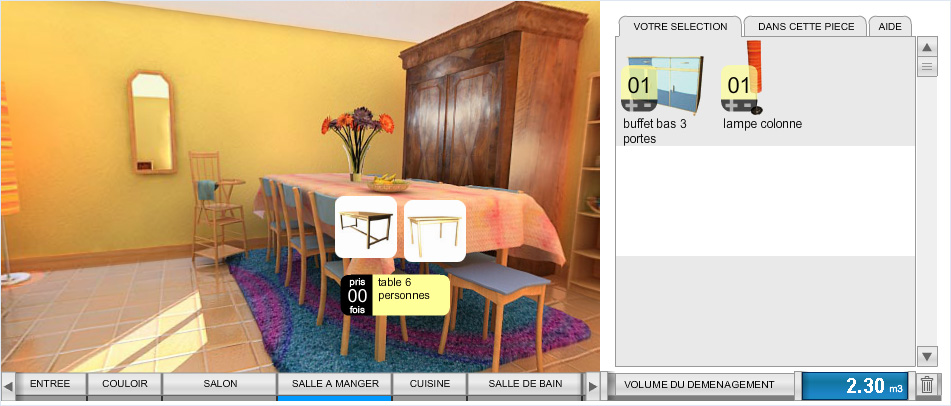
Instead of giving the damn list with the corresponding volume, they decided to do a 3D model of a house. The user navigates from room to room, and selects the furniture to be added to a list by clicking on it. I suppose I don't have to mention that the 3D navigation as clunky as it could possibly be.
Now imagine you have to move a piano. What room should you select? Probably a living room. You go there, you turn around (beware of seasickness), and you see no piano. Maybe in parent's room? Nope. By looking room after room, you end up finding it in... the hallway. That's right. At least they didn't put it in the closet.
Now imagine what would happen if anyone could have any sense when designing the interface? You would have a simple flat list of furniture with a filter box. You'll type “pi,” and the list would show:
- “piano”
- “piano bench”
- “picnic table”
- “pillow”
All it takes is two keystrokes and a click of a mouse (or four keystrokes), not five minutes of 3D navigation which makes you want to throw up.
The worst part is that they achieved to fail at every possible level. Their tool couldn't even tell the volume of individual furniture items, but only the sum. This means that if you need to do adjustments (such as “my table looks like this one, but it's slightly bigger, so I may be adding 0.5 m³ just to be sure”), you have no other choice than adding those elements one by one and computing the sum yourself.
Consequences
Such interfaces are not only harmful in terms of company image, giving the impression of amateurish company which finds that the time of their customers is valueless. They also indicate that the company decided to spend thousands of dollars developing some crap instead of spending much less to hire a decent interaction designer. The money they wasted is the money the customers will pay, and I don't want to be that customer.
Such desperate design could been easily avoided by applying the following basic principles:
Principle 1: A simple solution is better than a complex one.
Principle 2: A solution which allows a user to perform an action in a few basic actions (keystrokes, clicks, taps) is better than a solution which requires a lot of complex actions (3D navigation, manual search through a large amount of elements, etc.)
And, naturally, reusing a twenty years old interface of a product which miserably failed specifically because of its interface won't lead to a successful product. Especially when done by clueless people who understand nothing about interaction design.