
Monochrome laziness

Twelve years ago, Windows Vista was released, impressing everyone by its shiny, elaborate icons. For instance, a recycle bin was illustrated by a shiny transparent waste basket. Search functionality was shown in a form of a metallic magnifying glass. Not every icon was perfect and the obsession with glass was too intrusive, but at least there was an obvious effort to make the icons recognizable and attractive.

Figure 1 Nice, attractive graphics.
The era of graphical designers who do quality work seems to be finished now. Twelve years later, Windows 10 looks like a monochrome variant of Windows 2.0, and most designers seem to believe that there is nothing wrong, in 2019, to have an operating system which looks like one from 1987. This unwillingness to do quality work doesn't limit itself to Microsoft, and essentially all mainstream design community suddenly decided that less is more when it comes to work (but not the salary). If you can make an icon in ten seconds with three shapes in Adobe Illustrator, why bother?
This morning, I found myself in front of a “modern crap look” web application, glancing at a zone with three icons from Pixeden, a very popular icon set:


Figure 2 Laziness illustrated.
I have no idea what the first icon is expected to represent, and neither should you. Badly done, inverted spectacles, maybe?
The second one is slightly clearer; it seems to be a lifebuoy ring, made by a designer who have never seen a lifebuoy ring in his life, and was too lazy to go to Google Images before drawing one. If among the readers, there are designers who have never seen a lifebuoy ring either, I can explain. One of the goals of a lifebuoy ring is that it should be easy to spot one from a distance, including during the night. This means that it would usually be red or orange, and have reflective tape on its four sides. A tape is straight. In other words, it has the exact same width towards the inside of the ring as on the outside of it. That thing, above, is therefore something else.
The third one would be, I guess, an incandescent light bulb, although the position of the terminals and the filament don't seem natural. As it is understandable that a young intern who worked on this icon may have forgotten the last time he have seen an incandescent light bulb, a simple Google search for “incandescent light bulb” reveals that the photos of bulbs are shot from “face,” with both terminals clearly visible, not from the side. Showing it from the side when drawing an icon makes the icon less recognizable, while the goal of a designer of an icon should be the opposite—to make it as recognizable as possible.
I hoped I was unfortunate to have the worst icons of the set, but after checking the collection, it appeared that this is not the case. There are even things like that, which is possibly the most cryptic one:

Figure 3 Something particularly cryptic.
Other icon sets present the same issue. Here's an example from Material Icons, named alarm_on:

Figure 4 A meaningless assembly of abstract forms.
First, the alarm clock. The clock makes noise by moving a hammer between two bells. The hammer has to move quickly, which also means that the bells have to be close to each other. Like this:
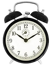
Figure 5 What an actual alarm clock looks like.
In the case of the icon, the bells are too far away from each other.
Second, the check box. Here's the Unicode character 0x2713:
Figure 6 A check mark.
It looks indeed like a check mark, i.e. someone would do when filling a form. Now, compare it to the check mark used by Material Icons. Sharp edges, straight lines. In a context of a clock, one could think that those are hour and minute clock hands, displaced for an unknown reason.
This is not an isolated case of unclear things in Material Icons. Example: a square with a sort of an arrow, which seems to be often used to represent multiple elements.

Figure 7 More meaningless abstract forms.
If this is the goal, why not having one square covering another square? Otherwise, what is the goal of the two lines at the left and at the bottom?
It seems, overall, that designers forgot the goal of design, which is to make the product easier to use. Instead, it became fashionable to make the least effort possible when designing an icon, letting the user to do the guesswork.
Interfaces themselves become more and more cryptic, with Windows 10 controls being basically rectangles, trying to avoid giving any clue about their purpose, i.e. if they are buttons or text boxes or just arbitrary stuff which doesn't accept any interaction. If you add cryptic icons to a cryptic interface, you obtain low quality interface. Most websites are unusable, and this is the fault of the fashion which pushes designers to be lazy. And unprofessional.