Aligning plain text with spaces and tabs

A fellow developer asked me how to solve the following problem. An application is displaying some data in a form of a grid. The user should be able to copy this data to a text field in a third-party application. The text field has no support for any presentation, and doesn't even support Unicode. Despite this, the data should “look nice,” i.e. to look like if there were actual columns, with text being left-aligned in every column.
Without any presentation features, one has only tabs and spaces to align elements. To complicate the matter, the third-party application uses a proprietary font which cannot be freely downloaded. The proprietary font cannot be changed, and is obviously not monospace.
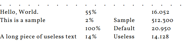
I suggested the following approach. In the sample below, “Hello, World” uses more space than “Bye,” “2%” uses less space than “45%,” etc. Arrows at the top indicate the tabs.

If I know the width of every character, for instance if I know that the letter “s” is eleven pixels wide, while the digit “6” uses thirteen pixels, and the capital “W” spans the whole twenty-two pixels, I can know the size of the content of a given “cell.” From there, I can know which one is the longest in a given column. This would give me an indication about the tab from which the next column should start. I can then find the position of the middle of the tab just before it: this is essentially the tab which follows the one where the longest text ends.
Every cell of the current column should receive as many spaces at the end of the text as needed to reach the middle of the next tab. Why the middle? Because it reduces the risk of being off by a few pixels: spaces are large enough, and so they don't make it possible to be pixel-perfect when aligning stuff. Instead, spaces will just lead the cursor to a middle of a tab, more or less a few pixels, and then a tab character would definitively move to the end of the tab.
Back to the example, “Hello, World” ends just before the tab 4, so one should target the middle of the tab 4 with the spaces. Similarly, “45%” ends at the very beginning of the tab 6, which leads us to the middle of the tab 7 as our target.
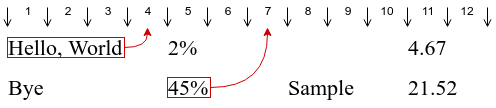
First, the code loops through the rows measures the size, in pixels, of every cell, and stores this size for later use. It also keeps track of the largest width for every column.
Second, the code loops one more time through the rows, and this time adds the required spaces. As previously stated, those spaces don't ensure that the cells of the same column will be all of the same size at a precision of one pixel: instead, they just make sure there are enough spaces in order for the string to end somewhere around the middle of the target tab. Here, for the first column, the cell of the second row uses a few more pixels than the cell of the first row.
When I explained the theory to my colleague, he didn't seem too convinced. He thought that the approach is too complicated, and would take a long time to be implemented. To prove that it's not, I tried to implement the actual algorithm. It took about forty five minutes.
But before implementing the algorithm, I had first to measure the space between the characters. This is relatively easy to do in less then ten minutes, but I preferred the hard way: to actually spend nearly two hours writing a script which would do it for me (it's funnier than to do it manually, right?) But first, I decided to do a fake screenshot with some fake data, since I don't have access the real third-party application or the real data.
Making the screenshot
The screenshot wasn't an easy one. First, I needed to select a font, and Google has tons of them, so I wasted at least half an hour looking at all those nice fonts. The next trouble was that browsers use kerning when displaying texts. Kerning is when the space between characters depends on the actual characters to make the text look nicer. For instance, when the letter “V” is following the letter “A,” the space between the letters can be reduced: the top left corner of “V” would appear a few pixels at the left of the bottom right of “A”. On the other hand, if it follows “M,” then it should have generous space: we don't want its top left to be over the top right of “M.”
This is all nice, but also actively harmful for what I'm doing. In fact, if I measure the width, in pixels, of every character, and then use it to assume the width of the whole string as being the sum of the widths of its characters, I'll be wrong most of the time.
Hopefully, CSS 3 makes it possible to disable kerning. That's nice.
In order to measure the widths of characters, the easiest way is to insert the pipe (vertical bar character) between every character, i.e. to do this:
A|B|C|D|E|F|G|H|I|J|K|L|⋯|4|5|6|7|8|9|
Obviously, the set of characters depends on the input: I have to include capital and small letters, digits, and all the symbols which could potentially appear in the input, including the space. I ended up with this page:
<link href="https://fonts.googleapis.com/css?family=Vollkorn" rel="stylesheet">
<div style="font-family: Vollkorn; font-size: 1.25em; font-kerning: none; letter
-spacing: 1px;">
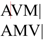
<div>A|B|C|D|E|F|G|H|I|J|K|L|M|N|O|P|Q|R|S|T|U|V|W|X|Y|Z|a|b|c|d|e|f|g|h|i|j|k|l
|m|n|o|p|q|r|s|t|u|v|w|x|y|z|0|1|2|3|4|5|6|7|8|9|.|,|%|-|+| |</div>
<div>AV.M|<br>VMA.|</div>
</div>
The last line checks that the kerning was disabled.
Taking the screenshot is easy: select the <div> in the Developer Tools, press Ctrl+Shift+P, type “screenshot,” select Capture node screenshot and enjoy. Here's what I got:

Measuring
The next step is to extract the width of every character from the screenshot. While a relatively easy task, it took me much longer than I would expect, basically because I was missing a few details at the beginning.
The script starts by reading the image, pixel by pixel. A parent loop walks through the image from left to right. A child loop walks from top to bottom for a given column.
The child loop's task is to determine whether the column contains a pipe character or something else, such as one of the bars of the capital “H.” This, it appeared, is not an obvious task. Anti-aliasing means that one won't have a black line; it won't even be gray, but something... well... complicated. However, by applying simple rules, one can have an algorithm which works pretty well once adjusted for a specific font and size. Here are its steps:
Take only one of the red-green-blue channels and ignore all others. In my case, I took blue, but any other would work as well.
Ignore every value higher than the threshold. In my case, I adjusted it several times, and ended up with a value of 128.
Ignore the sides of the image. This includes the very edge of the vertical lines: because of anti-aliasing, they have a very different color from the remaining part of the pipe.
Take the first value among the remaining ones in a column, and compare all other remaining values in the column. If at least one of the values is different enough, it's a sign that this is not a pipe.
Here's a part of the output of the Python script which performs those steps:
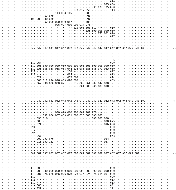
The arrows at the right indicate where the script thinks the pipes are.
The script then outputs a JSON string which contains the number of pixels for every character. This JSON looks like this and is used during the processing stage:
const widths = {"A": 13, "B": 15, "C": 15, "D": 17 ⋯ "-": 11, "+": 13, " ": 6};
Processing
Processing is done in two steps, called prepare and expand. Both are structured very similarly, with three functions: one acts on rows, the other one on cells within a row, and the final one on the individual cell. The first two functions are very simple. For instance, for the prepare step, they are:
const prepareRow = function (input) {
    return input.map(prepareCell);
};

const prepare = function (input) {
    return input.map(prepareRow);
};
The interesting things are happening within the third function.
For the first step, the third function measures the width of text, in pixels, and returns an object containing the original text and the width. In order to avoid doing an extra loop, it also collects, in an array, the information about the size used by the widest cell for every column.
const prepareCell = function (input, column) {
    const width = input
        .split('')
        .map(c => widths[c])
        .reduce((s, x) => s + x, 0);

    if (width > maxWidths[column]) {
        maxWidths[column] = width;
    }

    return {
        text: input,
        width: width,
    };
};
The array containing the maximum pixels by column is interesting, but not very useful in its original form. Instead, one would be more interested by knowing which tab should be targeted during the second step, or, more precisely, where is the middle of the target tab. This is done with a very simple transform:
Math.ceil(pos / tabSize) * tabSize + tabSize / 2
The result is then stored in an array called columnTargets. Based on this array, as well as on the structure returned by the first step, the second step adds the required spaces. Nothing fancy here either:
const expandCell = function (cell, column) {
    const targeted = columnTargets[column];
    const delta = targeted - cell.width;
    const spaces = Math.round(delta / spaceSize);
    return cell.text + ' '.repeat(spaces);
};
Result: less than one hundred lines of code for a result which looks rather nice, to paraphrase the spec. Check it yourself by seeing the source.