
Choosing a color for a brand

It is not unusual for some companies to spend numerous meetings discussing the color(s) to use for a logo of a product. Some may waste hours or days because nobody agrees about the color(s) but everyone agrees that choosing the wrong color will definitely destroy the product.
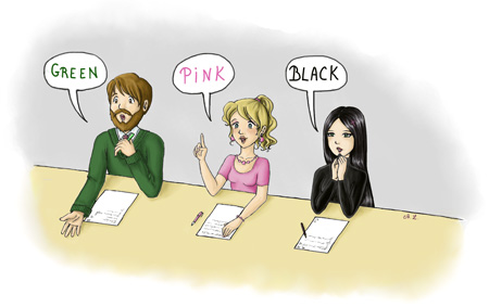 Illustration by Auréline Léonard
This is probably one of the most illustrative manifestations of Parkinson's Law of Triviality. Ideally:
You let the decision to a person you believe is competent in marketing, graphics, visual identity, or anything else you believe is related to color choosing. It doesn't matter whether this person is really competent. All that matters is that you believe that the choice was done by somebody smarter or more competent than you, and so this choice is right, even if you don't understand it.
Or you discuss the color with other people you trust for ten minutes, and since you cannot agree on the best color for your brand, you pick a random one and stick with it.
Without being condescending, nobody cares about the color of your brand. Have you ever seen a customer who refused to purchase Microsoft SQL Server because its logo is red? Have you ever seen a person who told you that she will never ever use any product by Symantec because their brand color is yellow? Do you know a lot of people who hate Apple because the apple on their logo is gray?
The fact that the symbolic of different colors may influence your customers is nonsense. As any other color-related discussions I heard from people who were designing their logo or brand. Let's see what are those discussions and why do they make no sense whatsoever.
Arguments
“Blue is a color of communication; our logo needs to be blue.”
Blue is the color of communication. Every company wants to show that their next big product has welcoming salespeople, helpful support, easy to use website, and in short has friendly and communicative people working on it.
Based on that, you've selected blue as the brand color for the product. Excellent.
- Red is the color of power.
- Orange is the color of warm.
- Yellow is the color of happiness.
- Green is the color of environment.
- Purple is the color of elegance.
Since you've chosen blue based on what colors represent, it means that from your point of view, your product is:
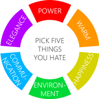
- Weak,
- Cold,
- Sorrowful,
- Polluting,
- Ugly.
Notice the nonsense?
Everyone wants to give an impression that their company is environment-friendly. But everyone also wants to make elegant products while giving an image of a powerful business, while being warm and hiring people full of happiness. If what colors represent matters so much for you, the only thing you can do is to have a logo with animated GIFs of joyful unicorns throwing shining rainbows and multi-color fireworks.
“The fashion this year is for green and the one the year before is for orange. Let's use those colors for our brand.”
This was an argument of a customer of mine to design the logo of his company.
First, what fashion? The company was related to fortune management. I never heard that in this business, there is a fashion for colors which change every year. Never mind; even if there is a fashion for colors in fortune management, using these criteria for a logo is weird. Not counting the fact that in a year, the logo will be, fashion-wise, obsolete.
Worst of all, such choice violates the elementary rules of color association. The two colors are neither complementary, nor analogous, nor triad-based. Showing on a logo that you don't know those most basic rules is embarrassing.
“In our sector, everyone uses red, so we should use it too.”
This one came from a customer who was working on a project of an e-commerce website selling spare parts for vehicles.
Sure, don't innovate and especially don't try to distinguish yourself from your competitors. Otherwise, some customer may notice you among all other companies with similar products.
Branding is about to be easily recognizable and the choice of a color is one of the ways to be recognized. By picking the color because it's used by your competitors is the exact opposite of you should do if you care about the colors of other companies selling similar stuff.
“There is only one color symbolizing the sector targeted by the product.”
EDF, French electric utility company, uses orange as its primary brand color and blue as complementary (opposite) color. Orange – the color of energy. Is the orange the only choice?
- NextEra Energy uses green and blue.
- Commonwealth Edison uses red.
- Scottish Hydro uses green and blue.
- Electrabel uses blue only.
While orange seems a wise choice, one could use red (power), yellow (energy from the sun), green (environment-friendly energy) or blue (wind turbines).
The same applies to any other sector. Nothing forces you to use a specific color every time.
“According to a recent survey, many of our potential customers like green color the most.”
According to a recent survey, there are people who like nuggets, so instead of creating a new CRM, you should start producing nuggets.
There is no such a thing as the best color. If you find a survey or a study telling that it's proven that you will have 122.4% increase in sales if you pick green over blue as your brand color, throw this survey or study away.
In all cases, people don't choose your product over a product of your competitor because they prefer the color of your brand. They do it because their friends told them that you're great, or because you have very competitive prices, or because you're known for producing products of a very high quality, or because you have an excellent support.
“Cultural references matter. We shouldn't choose red because it symbolizes danger in Japan.”
It also symbolizes purity in India and joy and luck in China, so you have to decide if you want to sell your product in Japan or in India and China.
Cultural references do matter when it comes to icons and symbols, but doesn't make sense for choosing a brand. No Japanese will refuse to visit your website because it has a white background while white is a color of death in Japan.
So it doesn't matter, is it?
Nope. Don't choose colors based on some fancy criteria, and especially don't spend hours or days on meetings, telling to other people that you should use green as your brand color because <whatever reason you like>. Customers would be yours because you're excellent, because you know your business, because you respect your customers, because you're competitive, because you have a solid reputation, etc. Nobody ever selects a brand over another because of its color. Select a random base color; any skillful designer will be able to do great things with any color.
The only thing that matters is that once your brand starts to be popular, changing the color is sometimes not an option, since customers may stop recognizing your brand. There are still exceptions. For example, recently Microsoft changed the four-color logo of Windows, to blue.